In a recent Facebook post on The Cameron Team business page, I jokingly said that I would happily play mediator to help save client’s marriages during disagreements about paint colors. Well, I decided it may be a good idea to touch on a specific point of color contention – what to paint your home’s interior when you’re getting it ready for the market.
You may have heard that a neutral color is the best way to go but with 100 shades of white on display at the local paint store, not to mention every other neutral color, how are you supposed to choose? I went to one of the best resources I have, the real estate agent hive mind.
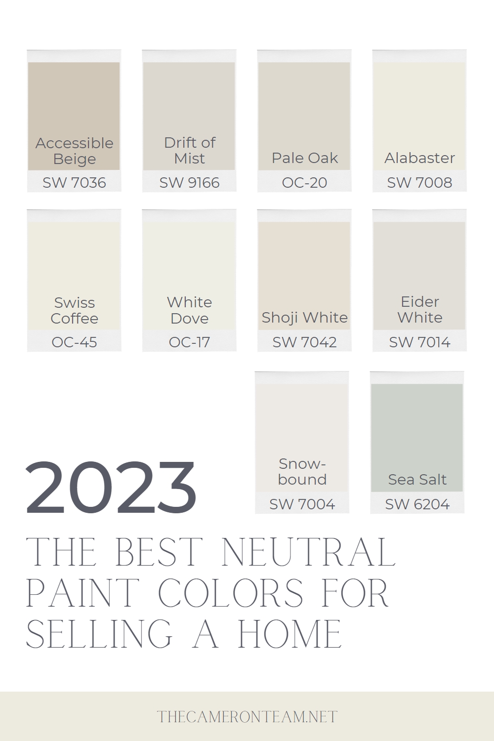
Below are the 2023 colors most frequently recommended by real estate agents in a private online discussion group. Many use them in their own homes and investment properties. In any case, this is a good starting point for choosing a neutral paint color.
Sherwin-Williams Accessible Beige in a Living Room
Beige
1. Sherwin-Williams Accessible Beige (SW 7036)
A few years ago, the grays swept the nation. Walls. Cabinets. Flooring. Everywhere you looked, home décor specialists were pushing gray (or greige, a cross between gray and beige). Now, things seem to be warming up, because beige is making a comeback. One of the more popular interior paint colors right now is Sherwin-Williams’ Accessible Beige.
Greige
2. Sherwin-Williams Drift of Mist (SW 9166)
Despite the renewed interest in beige, gray remains a popular choice for a neutral paint color. Sherwin-Williams’ Drift of Mist is a warm gray that could also be classified as a greige. It has green undertones, which goes well with a lot of home décor that is very on-trend right now.
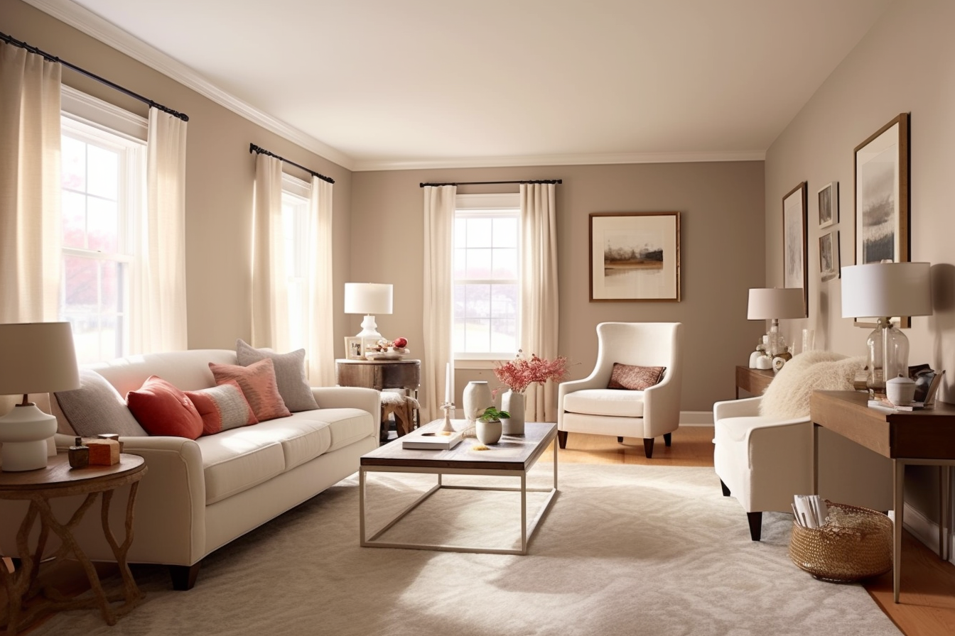
Benjamin Moore’s Pale Oak in a Foyer
3. Benjamin Moore Pale Oak (OC-20)
Looking for another warm gray? Benjamin Moore’s Pale Oak has a touch of taupe, so it’s the type of paint color that may look gray in the morning sunlight and beige in the afternoon, depending on the room’s position and lighting conditions. It also has pinkish undertones that can really pop out if you have other materials or décor in the room that also have pinkish (or even red) undertones. So, if that’s not something that appeals to you, you may want to avoid it.
Sherwin-Williams_Alabaster_White
White
4. Sherwin-Williams Alabaster White (SW 7008)
Light colors make rooms feel larger. That’s why many real estate agents recommend white paint. Sherwin-Williams Alabaster White was one of the most recommended colors in the agent poll. It has yellow and cream undertones, so it isn’t a stark white. It has a warm, inviting feeling.
5. Benjamin Moore Swiss Coffee (OC-45)
If Alabaster White isn’t quite warm enough for you, Benjamin Moore’s Swiss Coffee is a wildly popular color that has prominent yellow undertones with a touch of green. Yellow can feel overwhelming to some people, but these undertones look lovely when paired with dark floors and earthy tones. Considering how popular Cottagecore décor is, one can see why this shade may be so popular.
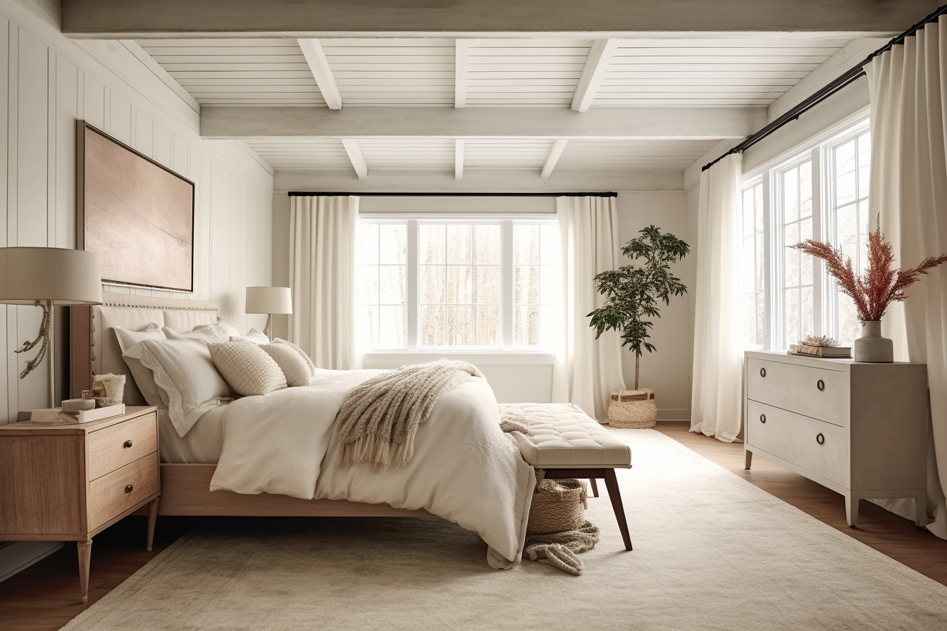
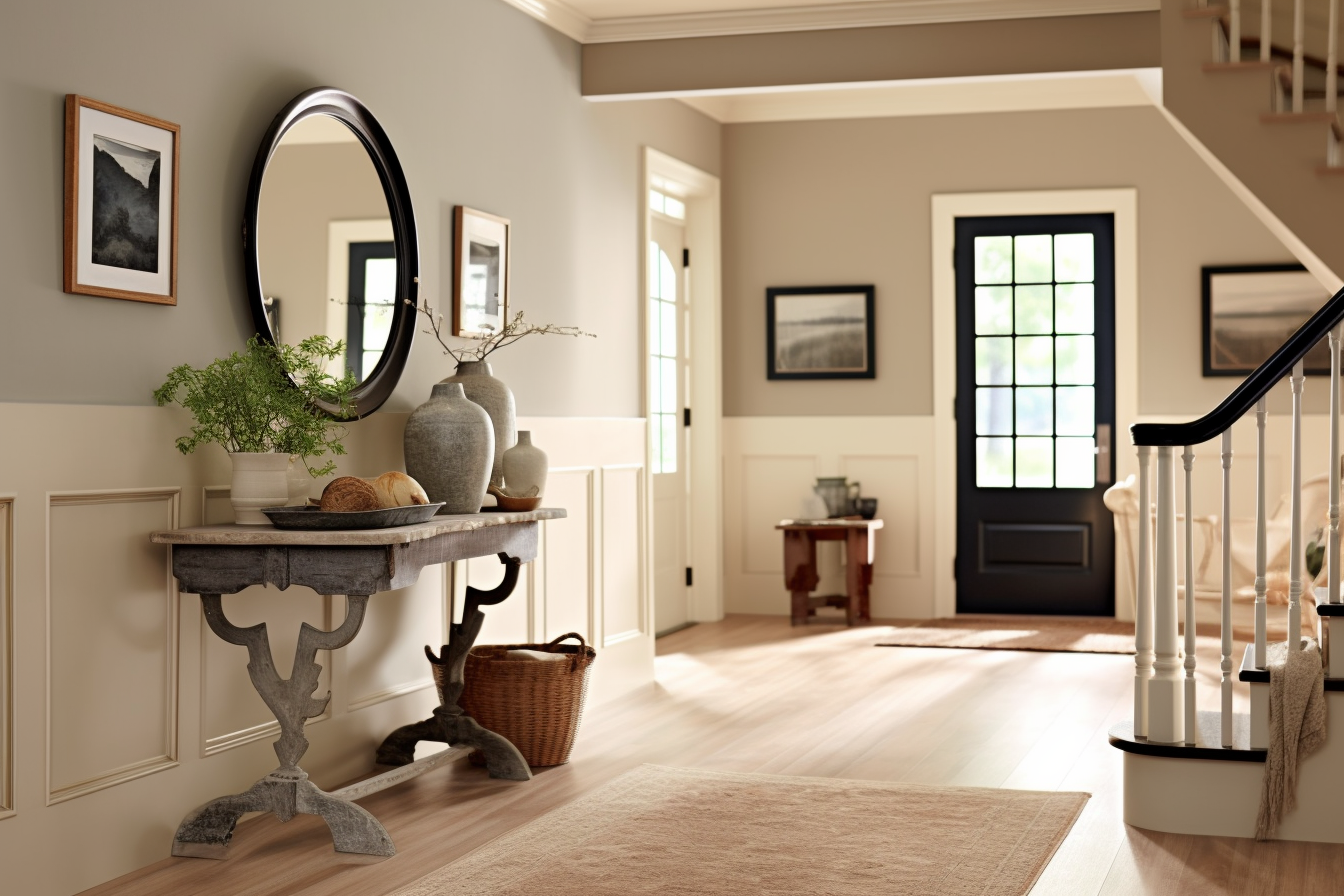
Benjamin Moore’s White Dove in a Bedroom
6. Benjamin Moore White Dove (OC-17)
Hey, look at that! Benjamin Moore’s White Dove is what I used on my front porch. This color is more creamy than white, and my favorite part is that it still looks bright when it’s gloomy outside. I recommend it to anyone who struggles with natural light in their home, because it will reflect any light that hits it and make your rooms feel more spacious and inviting.
7. Sherwin-Williams Shoji White (SW 7042)
If your home already has greige elements (cabinets, flooring, tile, or home décor), you may want a new interior color that blends well with them. Sherwin-Williams Shoji White is, of course, white, but it also has greige undertones. That means it’s a little warmer than some purer whites and doesn’t reflect as much light.
Sherwin-Williams Eider White
8. Sherwin-Williams Eider White (SW 7014)
Many interior decorators gravitate toward warmer colors, but if your décor is already on the cooler side (teal, blue, or violet), you may want to choose a cooler shade to make the home look cohesive. Sherwin-Williams’ Eider White is a light gray with violet undertones.
9. Sherwin-Williams Snowbound (SW 7004)
Another cool shade of white is Sherwin-Williams Snowbound. When it stands alone, it just looks white and can even come off as crisp white in the right lighting. But, compared to Eider White, it’s lighter and grayer. Snowbound reflects more light than the warmer shades, like Shoji White, so it will make darker rooms brighter than those shades of white.
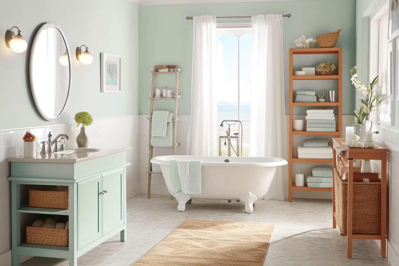
Sherwin-Williams Sea Salt
Green
10. Sherwin-Williams Sea Salt (SW 6204)
Some people describe Sherwin-Williams’ Sea Salt as green. Some describe it as blue. Some describe it blue-green…and green-blue. I think that is a testament to the way it can change under different lighting schemes. It’s a soft, muted color that has a touch of gray. It also fits well with our coastal lifestyle. Just keep in mind it doesn’t reflect as much light as the preceding colors, but it’s the perfect choice for someone who is tired of the white, gray, and beige triad.
Have you used any of these paint colors? Do you plan on using one? Let us know in the comments.
Best Neutral Paint Colors for Selling a Home in 2023