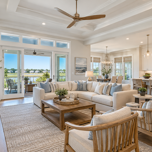
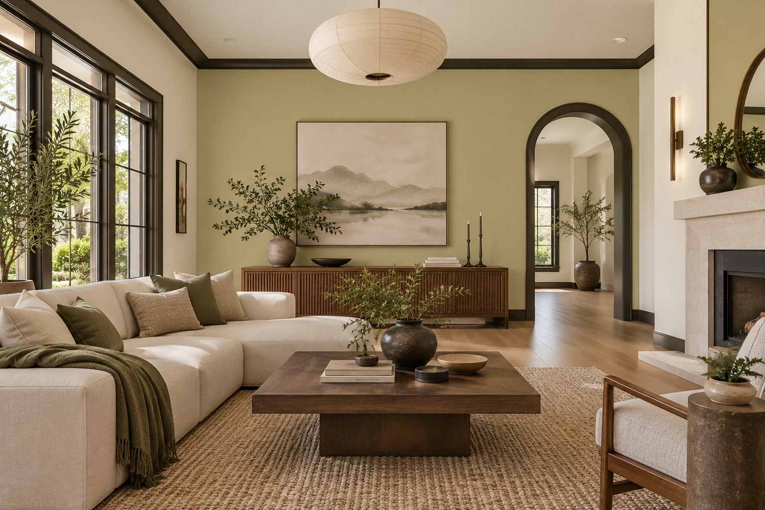
Every fall, the big paint companies drop their color forecasts, and every fall, sellers start wondering if they need to repaint before listing. This year is no different. Sherwin-Williams picked Celery, a soft yellow-green. Benjamin Moore went with Webster Green. Behr chose Grounded, a mossy olive. And running through all of it is a shared theme: nature-inspired color, faded blues, warm neutrals, and a handful of bolder accents like cherry lacquer and celestial yellow.
It's genuinely interesting stuff. But if you're getting ready to sell your home in Wilmington, Leland, Hampstead, or anywhere else in this area, the more useful question is: does any of this actually apply to you? Mostly yes, but probably not in the way the trend coverage makes it sound.
Key Takeaways
- 2027 trends favor nature-inspired color: Mossy greens, faded blues, warm neutrals, and earthy accents are the direction, but your walls don't need to follow.
- Keep strong color removable: Pillows, throws, towels, rugs, and art are the right place for trend-forward color. Paint and permanent finishes are not.
- Neutral foundations still sell homes: Buyers need to picture themselves in a space. A personal color palette, even a tasteful one, can work against that.
- Wilmington already fits the 2027 palette: Sand, marsh green, and weathered wood aren't trends here. They're just the landscape.
- Condition comes before color: No amount of clever staging corrects a bathroom that needs recaulking or a room that smells like a closed house.
- Staging for photography is different from decorating for living: Color choices matter most in how they read on a screen, not how they feel in person.
- Talk to your agent before buying anything: A pre-listing conversation is worth more than a trip to the paint store.
What Do the New Color Trends Mean for Sellers?
Here's the honest answer: color forecasts are useful context, not a listing checklist. What they tell us is where design culture is moving, and for 2027, that direction is toward colors that feel pulled from the natural world rather than selected from a builder's standard palette. The National Association of Realtors has noted that staging with trend-forward color works best when it lives in removable textiles, artwork, and accessories, not on every surface. That distinction matters a lot when you're preparing a home for sale, because you're not decorating for yourself anymore. You're creating a space a buyer can walk into and immediately feel at home in. The four colors getting the most attention heading into 2027 are fern green, retro blue, celestial yellow, and cherry lacquer. Each one can work in a staged home. But only when it's used with some restraint. A cherry lacquer throw pillow on a neutral sofa reads as warm and inviting. Cherry lacquer walls in the primary bedroom ask buyers to do extra mental work, and most won't.
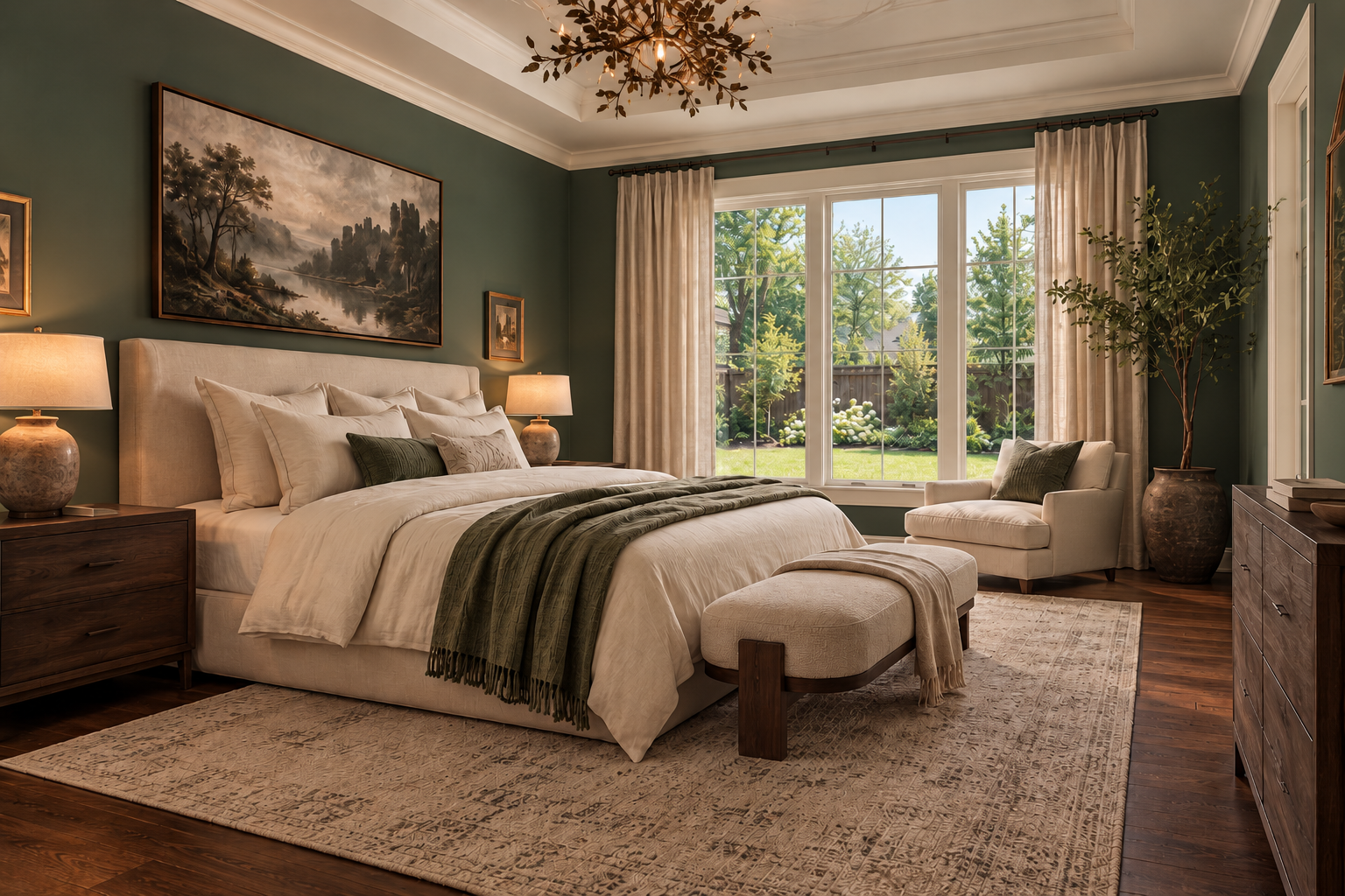
Benjamin Moore HC-130 (Webster Green)
When Is New Paint Worth the Cost Before a Sale?
This comes up with almost every seller I work with, and the answer is genuinely: it depends on what's already there. Paint is worth the cost when:
- Walls are visibly patched, scuffed, or stained and the existing color won't photograph cleanly
- The current color is very dark or very specific and it's quietly narrowing your buyer pool before anyone even walks through the door
- The trim looks dingy against freshly cleaned walls, which happens more often than sellers expect
Paint is probably not worth it when:
- The existing color is a clean, warm neutral that photographs well and doesn't distract
- You're swapping one trend for another without a real improvement in broad appeal
- The scope starts creeping from touching up one room into repainting the whole house
If you do paint, compare samples against your flooring, countertops, and trim in both morning and afternoon light before you commit. Colors shift in Wilmington homes depending on which direction your windows face, how much tree cover you have, and whether you're closer to the coast or further inland. What looks like a soft sage on the chip can look almost yellow by noon.
Where Can Stronger Colors Work in a Staged Home?
The principle is simple: keep the foundation neutral and layer color through things that can be swapped, moved, or packed when you leave. Here's how that plays out in practice:
- Living room: Neutral upholstery, then add color through two or three coordinated pillows. A fern green or dusty blue pillow against a cream or greige sofa is approachable and current without asking buyers to look past anything.
- Bedroom: Linen or sand-toned bedding as the base, then a muted olive or sage throw folded at the foot. One piece of artwork with a warm accent pulls the palette together without demanding attention.
- Bathrooms: Muted green towels, a woven basket, and a small ceramic tray do more work here than any paint color could. Buyers notice condition first in bathrooms. Color is a distant second.
- Dining area: A simple table runner in a warm earth tone and a few stems in a neutral vase. That's usually enough.
One thing worth doing before adding anything: edit first. Remove the competing patterns, the mismatched accents, and the things that have accumulated over years of actually living in the house. Editing almost always does more than adding.
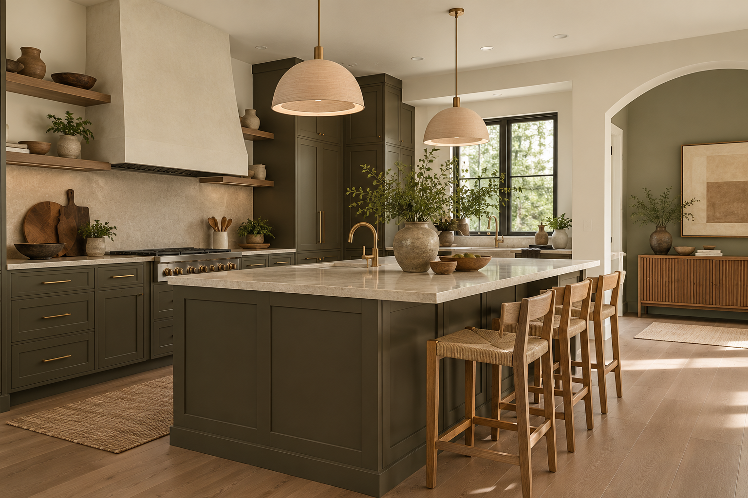
Behr T27-01 (Grounded)
How Should Color Fit a Coastal or Luxury Home?
Wilmington-area homes have a genuine advantage with the 2027 palette, and I say this as someone who has spent thirty years selling homes here. The landscape already looks like the trend board. The live oaks at Carolina Beach State Park, the salt marshes along the Intracoastal, the weathered wood on older beach cottages. Moss, sand, driftwood, and faded blue are not a design moment here. They're just what's outside the window. For a beach property in Carolina Beach or Kure Beach, that means staging doesn't need to force anything. Soft blue textiles, neutral upholstery, and uncluttered windows that let the view carry the room will photograph better than a space full of nautical props reminding buyers they're at the beach. They already know. For a golf-course or luxury home in a community like Landfall, Porters Neck, or St. James Plantation, the approach shifts a bit. Olive, ink blue, or a controlled plum accent can add warmth alongside existing wood, stone, or higher-end finishes. The goal is to complement what's already there, not introduce a palette that competes with the architecture. One practical thing worth checking before photography: how your indoor and outdoor spaces read together. A beautifully staged living room that leads to a screen porch with clashing cushions is a missed opportunity, especially in homes where outdoor living is part of the story.
What Should Come Before Trend-Driven Updates?
Before you spend a single dollar on pillows or paint, make sure the fundamentals are handled. Color is nice, but it doesn't fix what buyers notice first. The NAR's staging data is pretty clear on this: 91% of agents recommended decluttering, 88% recommended deep cleaning, and 83% of buyers' agents said staging helped buyers picture themselves in the home. Those numbers all point to the same thing. Buyers are evaluating livability before they're evaluating aesthetics. A clean, uncluttered home with good light and clearly defined rooms will outperform a heavily styled home with deferred maintenance. Every time, without exception. For most sellers I work with, the order looks something like this:
- Repairs first: Recaulk the bathrooms, fix the sticky doors, address any visible water staining
- Cleaning second: Windows, baseboards, grout, and appliances are exactly where buyers' eyes go
- Decluttering third: Less furniture almost always reads as more space in photos
- Color and styling last: Once the space is clean and clear, small color additions actually land
Professional photography and video come after all of that, not before. The camera captures what's actually there, and that's either working for you or against you.
Check out this article next