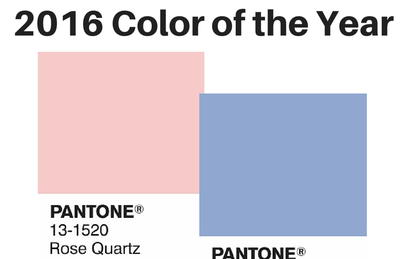
Pantone just announced their Color of the Year for 2016 and it’s actually TWO colors – Rose Quartz and Serenity. On their website, they shared a video portraying what they felt represented 2015 – images from major social issues and a chaotic, technologically driven world. Considering that their choices from the past 9 years have all been bold colors, one can only assume this year’s choice, which they describe as “reflecting connection and wellness as well as a soothing sense of order and peace”, is their answer to a world filled with growing tension and daily stress.
The Color of the Year usually makes its way into clothing and home décor, so you’ll probably see it – correction – see them popping up in stores soon. I fully understand their intention for choosing these two colors, but my concern is that Rose Quartz is pink, not exactly the pink popular in the 1950’s, but still pink. I know there are people who are diehard pink fans, but home buyers have been gawking at pink for years – pink tile, pink carpet, wallpaper, pink paint colors. Want to slow down the sale of your home? Include pink in your décor. I can only hope that people will use it sparingly, especially if they plan to sell their home.
Personally, the light pink and light blue combo brings back flashes of childhood visits to businesses, who all had basically the same pastel artwork hung on their walls (usually in a gold frame). It was ugly then and still has that outdated feeling when I see it in a home. 2016’s colors also look a bit like a gender reveal, don’t you think?
Luckily, Pantone has provide some color palettes that make the pink and blue color combination a little less overwhelming if you’re planning to incorporate it into your home décor. You can view all of them here.


