Color is one of the most powerful tools in home design—subtle enough to work on our subconscious but strong enough to influence our emotions, decisions, and even our sense of space. Whether you’re staging a home for sale or planning a renovation, the colors you choose can significantly impact how buyers perceive your property.
But this isn’t just about aesthetics. The psychology of color is a real, research-backed phenomenon that interior designers and marketers have been using for decades. In real estate, understanding how color influences buyer behavior can help you create a home environment that feels warm, welcoming, and ultimately, desirable.
In this article, we’ll break down:
-
How different colors affect mood and perception
-
Which colors work best in each room of the house
-
The difference between staging for mass appeal vs. personal style
-
What current design trends are saying about color
-
Real-world tips for choosing a palette that helps homes sell faster
Why Color Psychology Matters in Real Estate
Before a buyer ever notices the quality of the cabinets or the age of the roof, they feel something when they walk through the front door. That “first impression” isn’t always tied to logical analysis—it’s often emotional, and color plays a huge role.
Studies show that people make subconscious judgments about a space within 90 seconds of viewing it, and up to 90% of that assessment is based on color alone. While factors like lighting, layout, and furniture style also matter, the wall color, accents, and even the finish of the floors or cabinets can trigger specific emotional responses.
In short: the wrong colors can create unease or even drive buyers away. The right colors can subtly encourage a sale.
The Emotional Impact of Color: Room-by-Room
Let’s explore how different colors affect people emotionally—and how that translates into design choices for each part of a home.
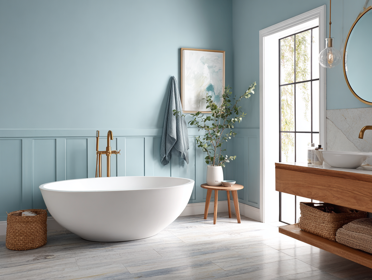
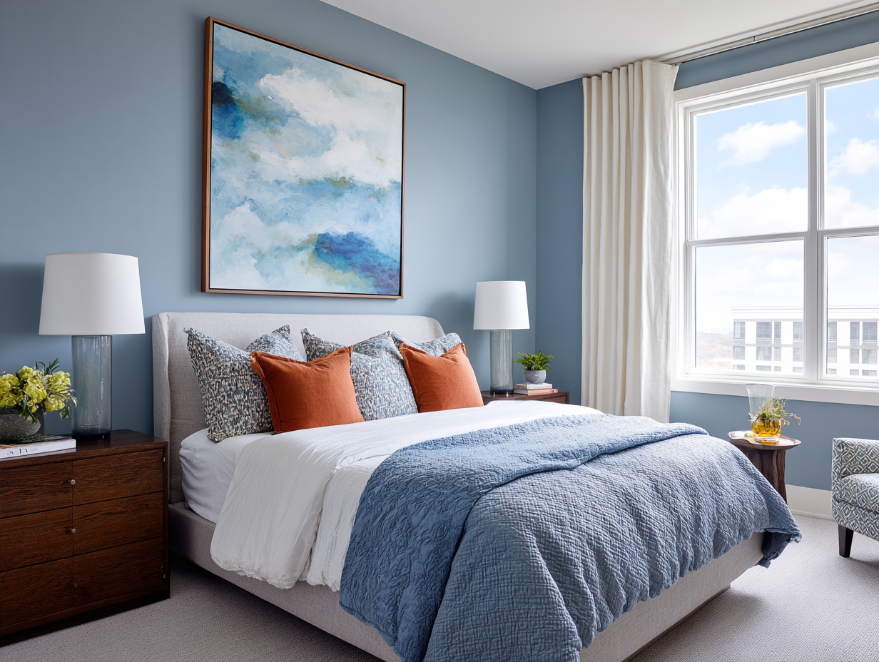
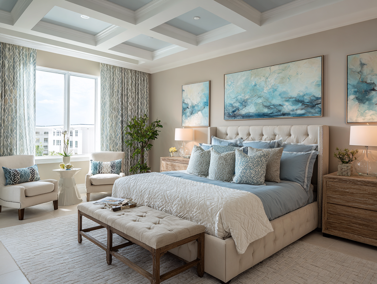
🔵 Blue: Calm, Trustworthy, Serene
Blue is one of the most universally liked colors. It evokes feelings of peace and security, which is why it works beautifully in bedrooms, bathrooms, and home offices. Lighter blues promote relaxation, while darker navy tones feel classic and refined.
In real estate: Blue-painted bathrooms have been statistically shown to sell for more than those in other colors (Zillow data has consistently backed this trend). It’s a safe bet for spaces meant to feel clean, crisp, and inviting.
Blue Bedroom
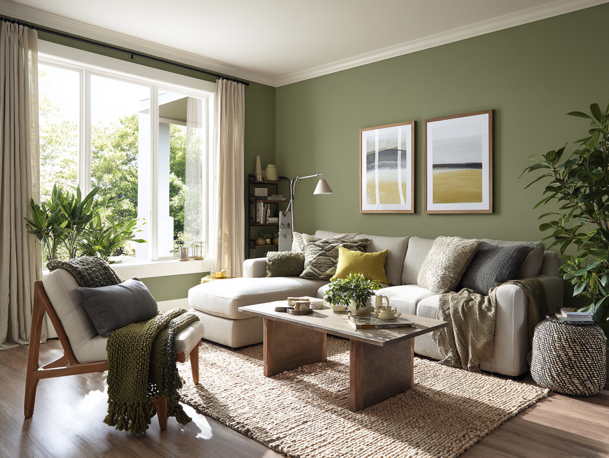
🟢 Green: Balanced, Natural, Restful
Green brings the outdoors in. It’s associated with growth, renewal, and tranquility. Because it sits between warm and cool tones, green is a versatile color that can ground a space without overwhelming it.
Where it works: Living rooms, bedrooms, and reading nooks benefit from soft sage or mossy greens. Deep emerald can add sophistication in small doses, like accent walls or cabinetry.
In real estate: Green helps buyers feel connected to nature, which is especially appealing in suburban or coastal areas like Wilmington, NC, where natural surroundings are a major selling point.
Mossy-Green Living Room
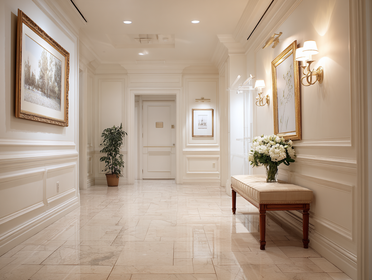
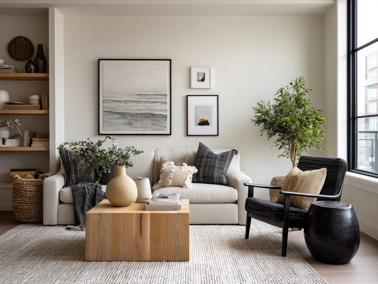
⚪ Neutrals: Safe, Spacious, Flexible
White, beige, taupe, and soft greys are staples in home staging for a reason. They’re clean, reflective, and make spaces feel larger. They also allow buyers to envision their own furniture and style.
But beware: stark white can feel sterile or cold. Warmer whites and greige (a blend of grey and beige) tend to feel softer and more inviting.
In real estate: Neutral tones are the go-to choice for maximizing buyer appeal, especially in living rooms, hallways, and open-concept spaces. They photograph well and serve as a blank canvas.
Warm White Foyer
🔴 Red: Bold, Energetic, Stimulating
Red is a high-energy color that raises the heart rate and creates urgency—great for restaurants and marketing campaigns, not so great for bedrooms or meditation rooms.
Where it can work: As a pop of color in accessories, artwork, or even a painted door. Red can add drama in formal dining rooms when paired with traditional decor, but it should be used sparingly.
In real estate: Too much red can feel aggressive or overly personal. If used, it should be carefully balanced with neutrals.
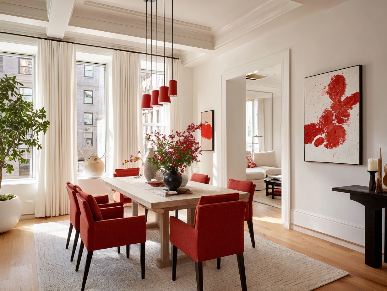
Pops of Red in Dining Room
🟡 Yellow: Cheerful, Warm, Optimistic
Yellow radiates happiness and light. It can make small, dark rooms feel sunny and expansive. However, it’s also a polarizing color—too much can cause anxiety or visual fatigue.
Where it shines: Kitchens, breakfast nooks, and entryways can benefit from soft buttery tones or golden hues.
In real estate: A splash of yellow can feel welcoming, but bright lemon or neon tones can be off-putting. Stick to muted or pastel shades for broader appeal.
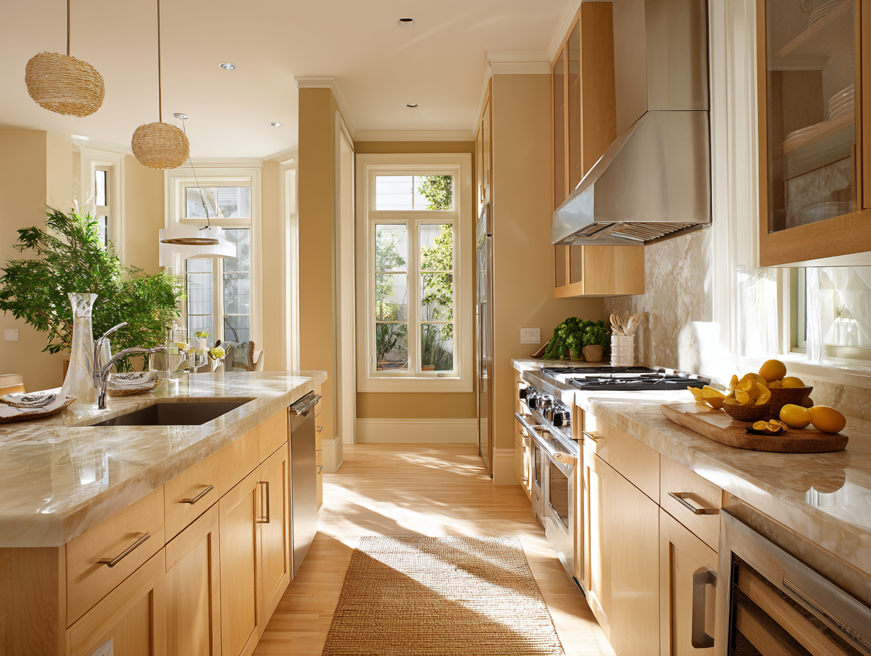
Buttery Yellow Kitchen
⚫ Black and Charcoal: Sophisticated, Bold, Modern
Black and deep charcoal exude luxury and modernity. They make a strong statement when used strategically—think matte black fixtures, cabinetry, or accent walls.
In small doses, these dark tones add contrast and drama. But too much can make a space feel confined or somber.
In real estate: Use black to create focal points or highlight architectural details—but don’t let it dominate a space unless it’s part of a very intentional high-end design.
Minimalist Living Room with Charcoal Accent Pieces
How Color Affects Perception of Space
Beyond emotion, color also alters our spatial perception:
-
Light colors (like white, beige, or pale grey) reflect more light and make a room feel larger and airier.
-
Dark colors absorb light and can make a space feel smaller or more intimate.
-
Cool tones recede visually, helping walls feel farther away.
-
Warm tones advance, making rooms feel cozier but sometimes more cramped.
That’s why small homes or condos often use cool, pale tones to expand the visual space, while larger homes may embrace darker or richer palettes.
Color Trends vs. Buyer Psychology: What Sellers Should Know
Interior design trends shift frequently—one year it’s all about blush pink and gold accents; the next, it’s sage green and matte black. As tempting as it is to go all-in on a trend, sellers should prioritize timeless over trendy when prepping a home for sale.
For example:
-
2024–2025 color trends include earthy tones like terracotta, warm clay, deep greens, and muted blues. These work well because they blend emotional warmth with a grounded, natural feel.
-
Avoid polarizing colors like bright orange, hot pink, or high-gloss finishes unless they’re very tastefully applied in a modern setting.
Ultimately, the goal is to appeal to the broadest number of buyers. You want people to feel comfortable, inspired, and able to imagine their own lives in the space.
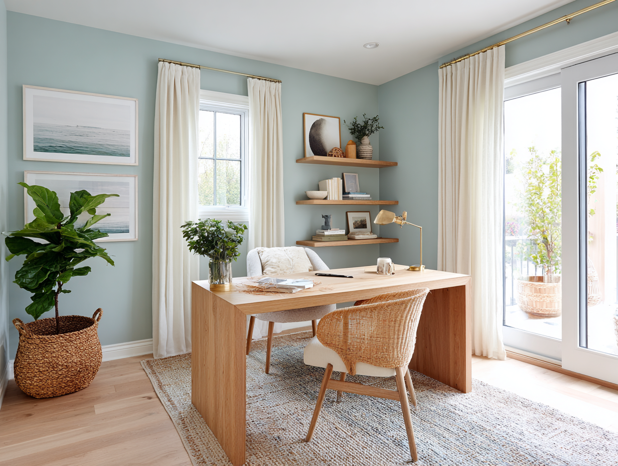
Light Blue Home Office
Staging for Emotion: Using Color to Tell a Story
Color is also an essential tool for storytelling in staging. A well-chosen palette can make a home feel like a sanctuary, a creative retreat, or a bustling family hub.
Here’s how to create emotional cues using color:
-
Create flow: Use a consistent color palette throughout the home to make the layout feel cohesive. Vary shades slightly from room to room to keep it interesting.
-
Highlight lifestyle: For example, a beach house might use breezy aquas and whites to evoke coastal relaxation. A modern urban loft could use greys, blacks, and cool blues for a sleek, professional vibe.
-
Use accessories: Throw pillows, artwork, area rugs, and flowers are great ways to inject color without commitment. These elements can tie rooms together and create visual continuity.
Real Estate Color Mistakes to Avoid
Even well-meaning sellers sometimes get color wrong. Here are common pitfalls to avoid:
-
Too much personalization: That lime green accent wall may be “so you,” but it could be a dealbreaker for buyers.
-
Inconsistent color palette: Jumping from bold red in the kitchen to pastel purple in the bathroom can feel jarring.
-
Ignoring lighting: Colors look different in natural daylight vs. artificial lighting. Always test paint swatches under different lighting conditions.
-
Going too trendy: What’s stylish today may look dated tomorrow—and buyers may be wary of having to repaint right away.
-
Overuse of white: All-white spaces can feel clinical or unfinished unless softened with textures and warm undertones.
Neutral Bedroom
Practical Tips for Choosing Buyer-Friendly Colors
If you’re preparing a home for market, here are some safe and effective strategies:
✅ Use warm neutrals like greige, cream, and soft taupe as your base.
✅ Add color with accessories, like throw blankets, planters, or curtains.
✅ Paint smaller rooms in light cool tones to make them feel larger.
✅ Use darker colors in moderation to create visual interest or coziness.
✅ Coordinate trim and ceiling colors for a polished, unified look.
✅ Test colors in real lighting before painting the entire room.
Final Thoughts: Color Is More Than Cosmetic
The psychology of color isn’t just a design buzzword—it’s a fundamental part of how we experience space. In real estate, that means color has real, measurable power to attract, engage, and persuade buyers. A home with a carefully curated palette can feel move-in ready, emotionally resonant, and worth every penny.
Whether you’re a homeowner thinking about selling or a real estate agent advising clients, understanding how color works on both a visual and psychological level can make all the difference. When you get it right, you’re not just decorating a house—you’re creating a home people want to live in.