This is Post #2 of the 2018 Home Trend to Watch Series. View the first one: Geometric Patterns.
As we look forward to 2018, we can expect to see some of the trends we’ve already experienced in 2017. For those of you in love with the Typography trend, you’ll be happy to know that Pantone predicted it’ll be hanging around another year. If you aren’t familiar with Typography, as it pertains to homes, this is the art and technique of using letters, words, and phrases in decorating. It’s been gaining momentum for a few years, which leaves the question, “how can we freshen it up in 2018?” We have a few ideas…
Vintage Industrial Typography
Make your home feel like it’s stepped back into another time by going vintage industrial with your typography. Choose classic fonts and colors, and give the display an aged look. This picture from Messy Nessy Chic is the look you should be aiming for.
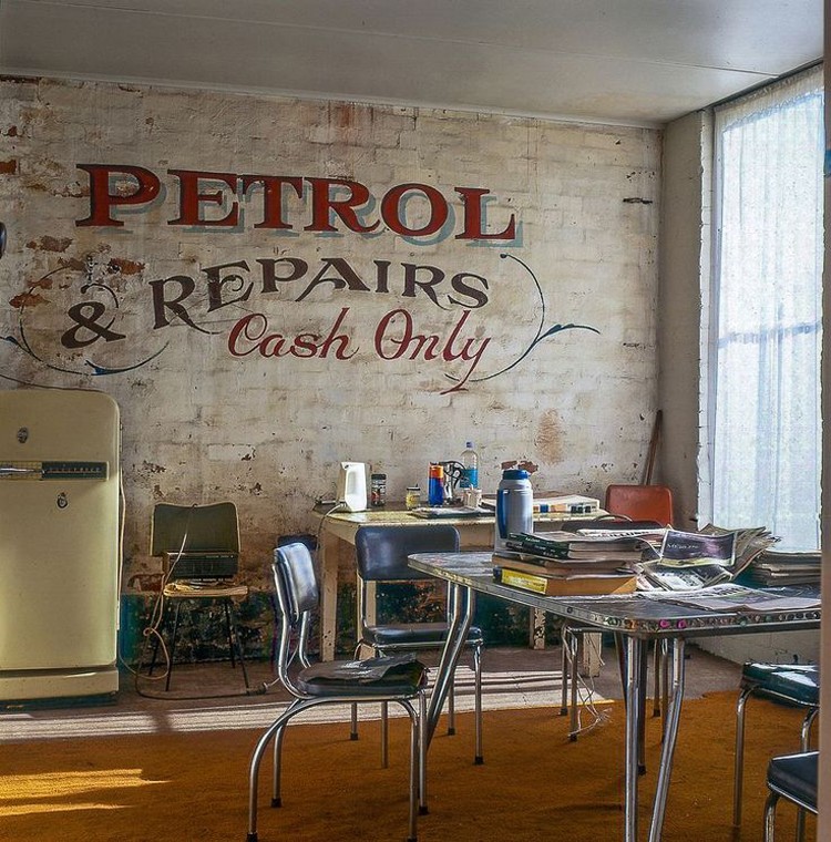
Industrial Typography – Mess Ness Chic
If large murals aren’t your forte, recycling a vintage sign is also a great way to incorporate vintage industrial into your home. This vintage apothecary sign shared by My Warehouse Home is a good example of that. It serves as a beautiful focal point for this contemporary kitchen, and the gold lettering ties in nicely with the gold tones of the counters and flooring.
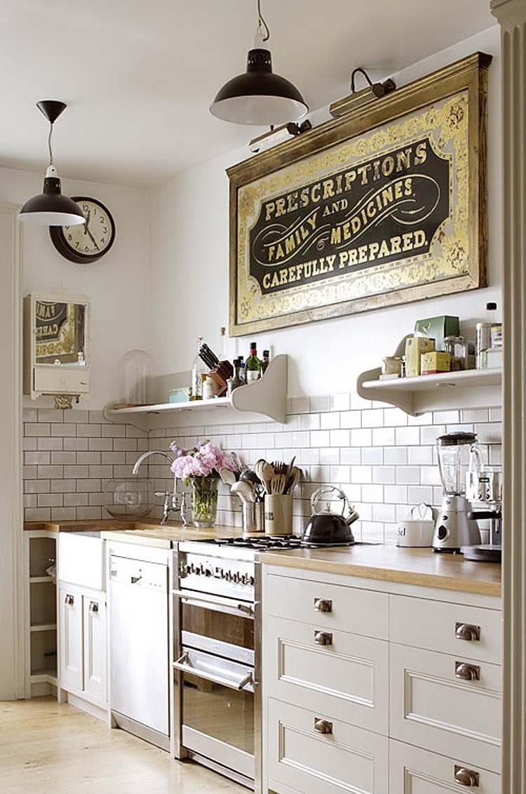
Vintage Apothecary Sign – My Warehouse Home
Please note: The Cameron Team has not been paid or received any other compensation to include any of the products featured on this post, but the author has included affiliate links and content. If you click on a link, they may earn a commission with no added cost to you. It’s a high-five for great content!
Of course, the easiest way to incorporate vintage industrial is to decorate with metal letters. The more aged, the better. Artists like MudDauberMtg sell metal letters on Etsy. These ones are made of steel…

eat Metal Sign – MudDauberMtg
Big Typography
Make a statement with typography by going big and bold. This “Wonderful” display was featured on Apartment Therapy. It was created with salvaged letters. If you’re into eclectic industrial, make sure you check out the whole home tour.

“Wonderful” Typography Sign – Apartment Therapy
The reigning family of typography has to be The Gaines. Chip and Joanna of HGTV’s Fixxer Upper love to use letters, vintage signs, and salvaged letter décor in their homes. Here is one great example from the home they made over in Woodway, TX.
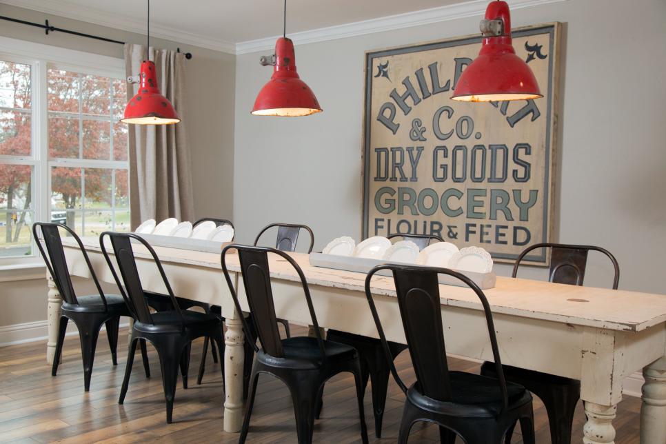
Grocery Typography Sign – Fixxer Upper
If you go big, make sure you go simple. Too many colors and elaborate typefaces can make your home feel like the circus. (Unless, of course, you’re into that. We don’t judge.) These simple white letters, combined with the straight lines of the wall panels, make a big impact. The room was designed by Visbeen Architects and Benchmark Wood Studio.

Beach House Typography – Visbeen Architects and Benchmark Wood Studio
Understated Typography
Big and bold can really make a statement, but understated can be just as beautiful. Matter-of-fact, it can be downright elegant. Take for example this warehouse bedroom styled by Carole Poirot and Sophie Bush. The wisp-like white ghost letters on the wall are just enough to portray a message without drowning out the surrounding décor.
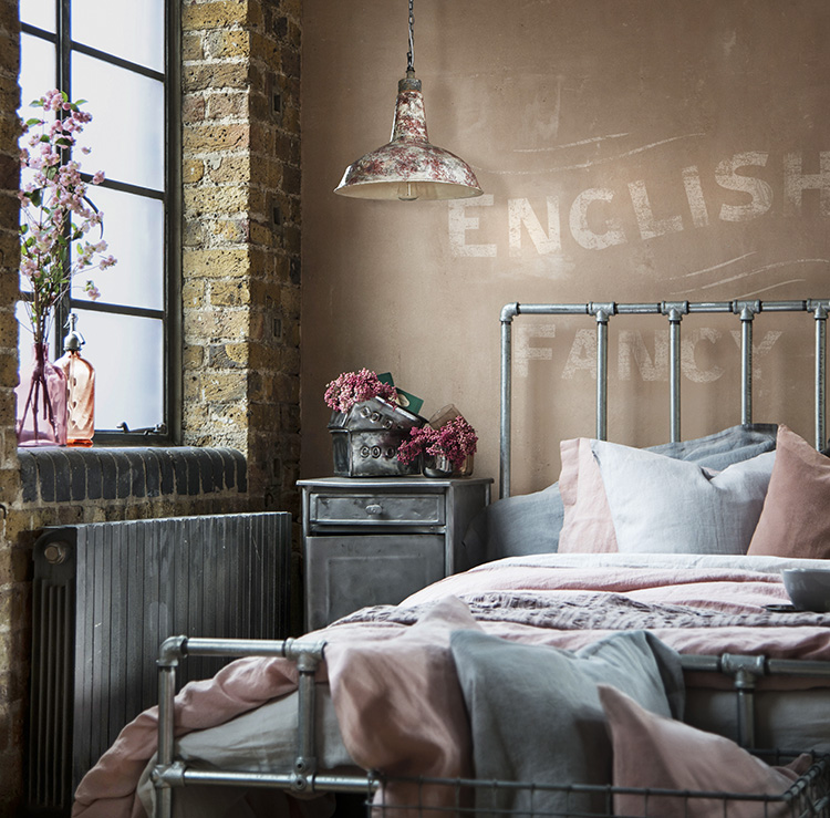
Understated Typography in Bedroom – Carole Poirot and Sophie Bush
Another example is this large S in Kristin Theiss’ toddler’s bedroom. It incorporates a monogram without being overwhelming, and can be easily replicated with a projector and paint. Just choose two paint colors that are a few tones different from each other.
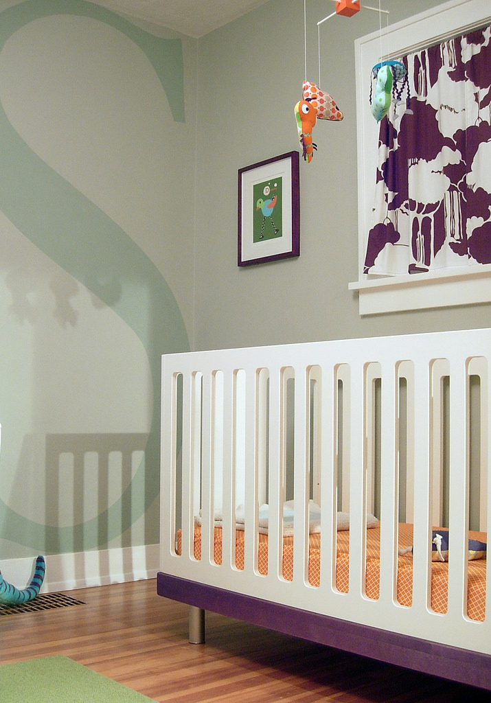
Monogram S – Kristin Theiss
Decoupage Typography
Creating your own custom letters is a great way to add a theme to a room, which is why you’ll often to see decoupage letters in kid’s rooms. These comic book letters from Craftcuts are a fun project for super-hero-loving youngsters.
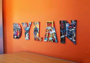
Comic Book Letters Typography – Craftcuts
Another example is this Dr. Seuss typography project from the Money Saving Sisters. It’s perfect for a reading nook. They used Mod Podge and stock craft store letters to cover the word “READ” with pages from a Dr. Seuss book. You can find a whole step-by-step on how to do it on their website.
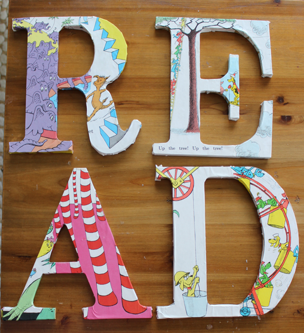
Dr Seuss READ Typography – Money Saving Sisters
Looking for something a little more grown up? David from Cheltenham Road created this Cincinnati themed HOME sign. Wouldn’t it be great customized for a favorite sports team or vacation home?

Cincinnatti Home Typography – Cheltenham Road
For something extra special for you, decoupage a marriage or birth certificate (a copy, of course!). Make. Bake. Create. shared how they created a marriage certificate monogram on their blog. We think something like this would pair great with a decoupage picture from the same day. What do you think?
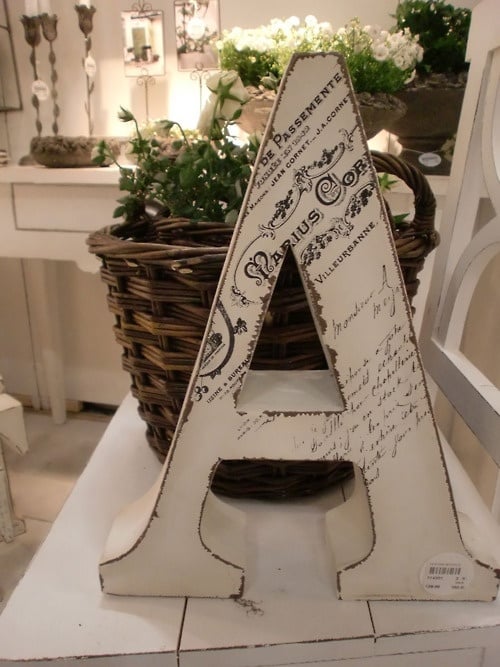
Marriage Certificate Typography – Make. Bake. Create.
Furniture Typography
Printed artwork, 3D signs, and pillows are popular ways to incorporate the typography trend into your home décor, but furniture can also be a fun approach. Take for instance this refurbished dresser from David at Cheltenham Road, who you just saw mentioned above. He used stencils to incorporate landmarks from around London on the front.

London Dresser – Cheltenham Road
David’s dresser was inspired by this New York City Dresser from Lindauer Designs, which uses a slightly different color scheme and approach.

New York Dresser – Lindauer Designs
You can also transfer typography images to furniture. Jen at Repurposed Gems shows how she did it with this beautiful buffet. She also uses milk paint, which is a very trendy refinishing approach right now.
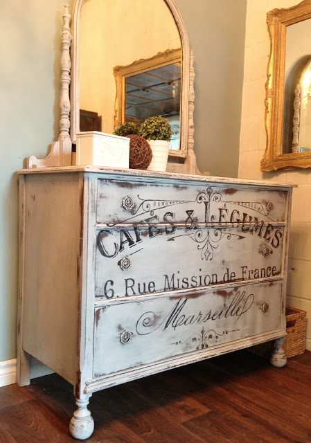
French Buffet – Repurposed Gems
All of these are great DIY examples. However, if that’s not your thing, there are a ton of artists on Etsy (try searching local), who will create typography furniture for you, like the SouthernSunShop (Atlanta, GA). They created this handsome industrial coffee table.
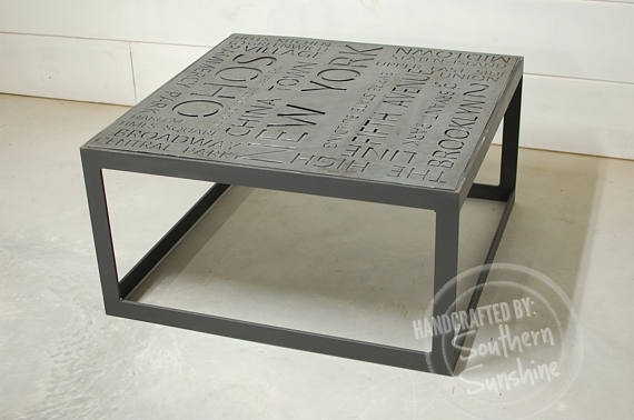
New York City Art Industrial Coffee Table – Southern Sun Shop
Conclusion
These are just a few examples of how typography can be incorporated into your home décor in new and exciting ways. Didn’t see one you liked here? There are so many fun examples on Pinterest – it doesn’t matter if your home style is farmhouse chic, modern, or beach themed – it’s hard not to find something that will fit what you’re looking for.
Do you have a favorite typography product or design idea? Share it in the comments!
See post #3 of the 2018 Home Trend to Watch Series: Wood Treatments.
2018 Home Trend to Watch: Typography
Related Posts
[the_grid name=”Homeowner Tips”]


