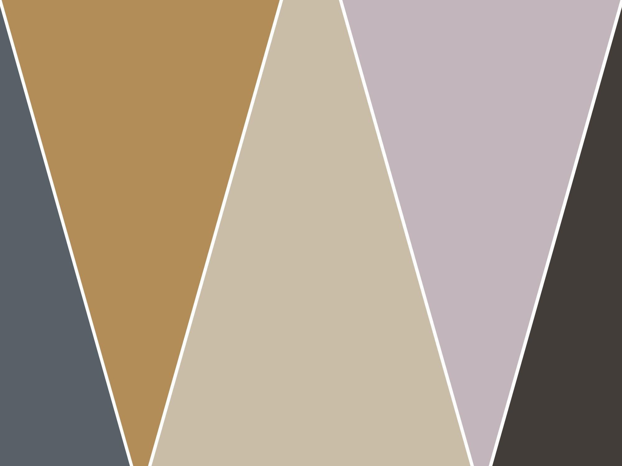
The 2025 Color Capsule from Sherwin-Williams features a mix of warm neutrals, soft shades, and playful pops of color that can transform your home’s interior. Whether you’re looking to make a subtle update or completely revamp a room, this collection has something for everyone. Here’s how to incorporate these colors into your space:
1. Create a Stable Foundation with “Grounded” (SW 6089)
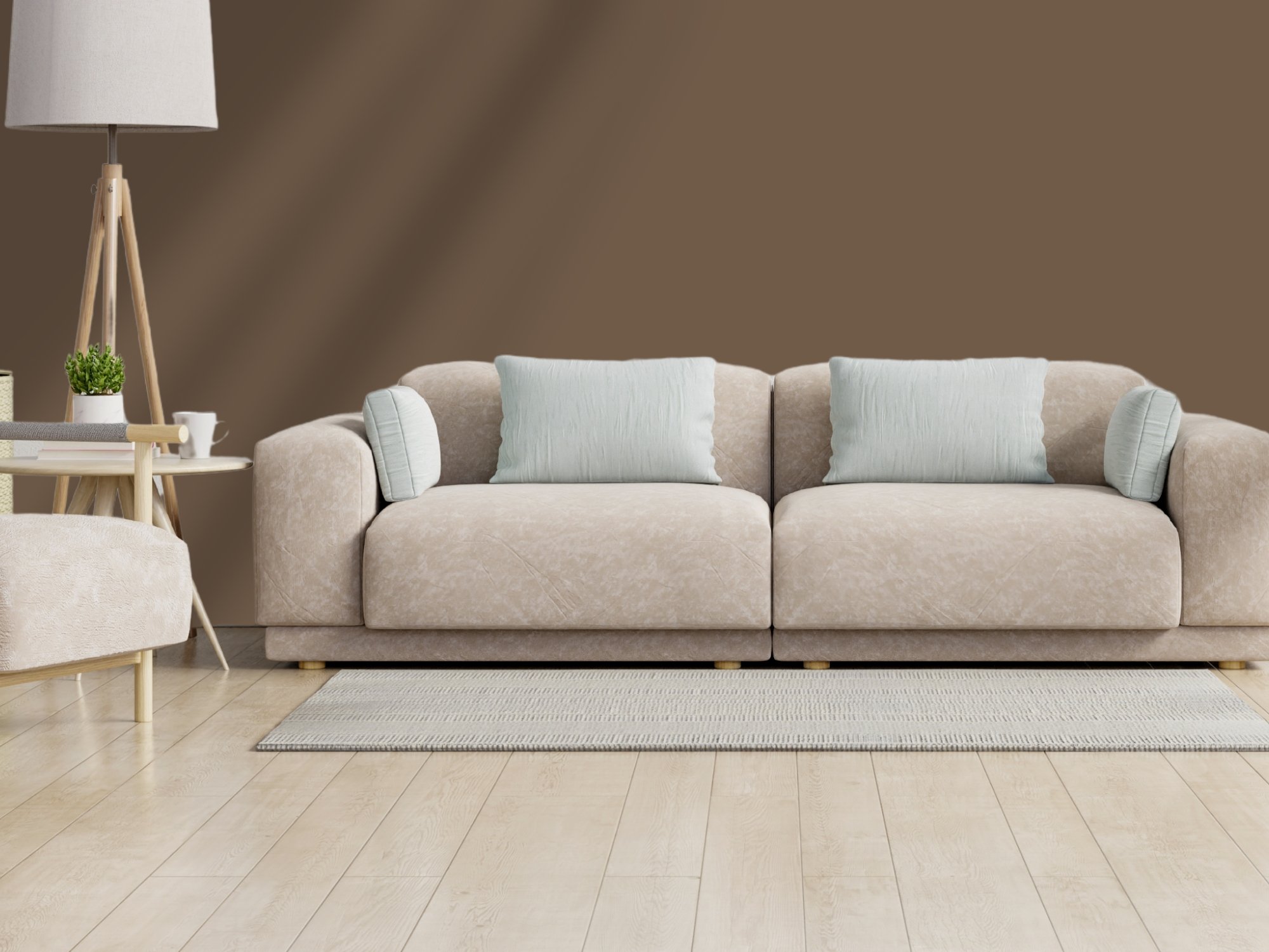
Grounded (SW 6089)
“Grounded” is a rich brown that brings a sense of warmth and earthiness to any room. It’s perfect for larger living spaces like family rooms or open-plan areas where you want to evoke stability and comfort. Pair this shade with soft fabrics like velvet or leather and wooden furniture to enhance its organic vibe. Consider using it on an accent wall behind your sofa or TV unit for a dramatic yet inviting focal point.
2. Soften Your Space with “Sunbleached” (SW 9585)
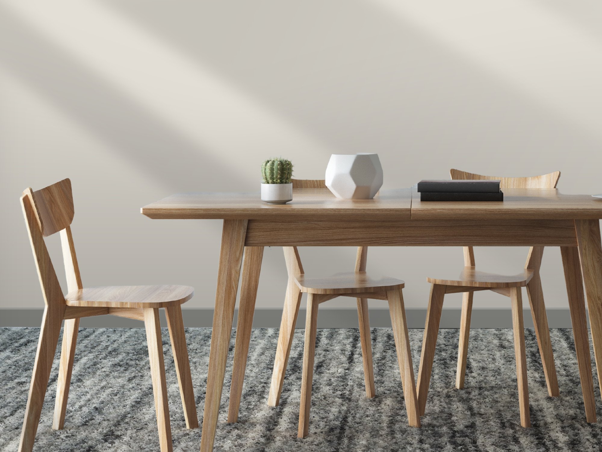
Sunbleached (SW 9585)
For rooms where you want a light and airy atmosphere, “Sunbleached” offers an elegant neutral that sits between beige and gray. It’s ideal for living rooms, dining areas, or even kitchens. This color adds depth while maintaining a calm aesthetic, making it an excellent backdrop for minimalist decor. Pair it with light woods, white textiles, or even subtle metallic accents to emphasize its sophisticated, breezy feel.
3. Add Playful Energy with “Chartreuse” (SW 0073)
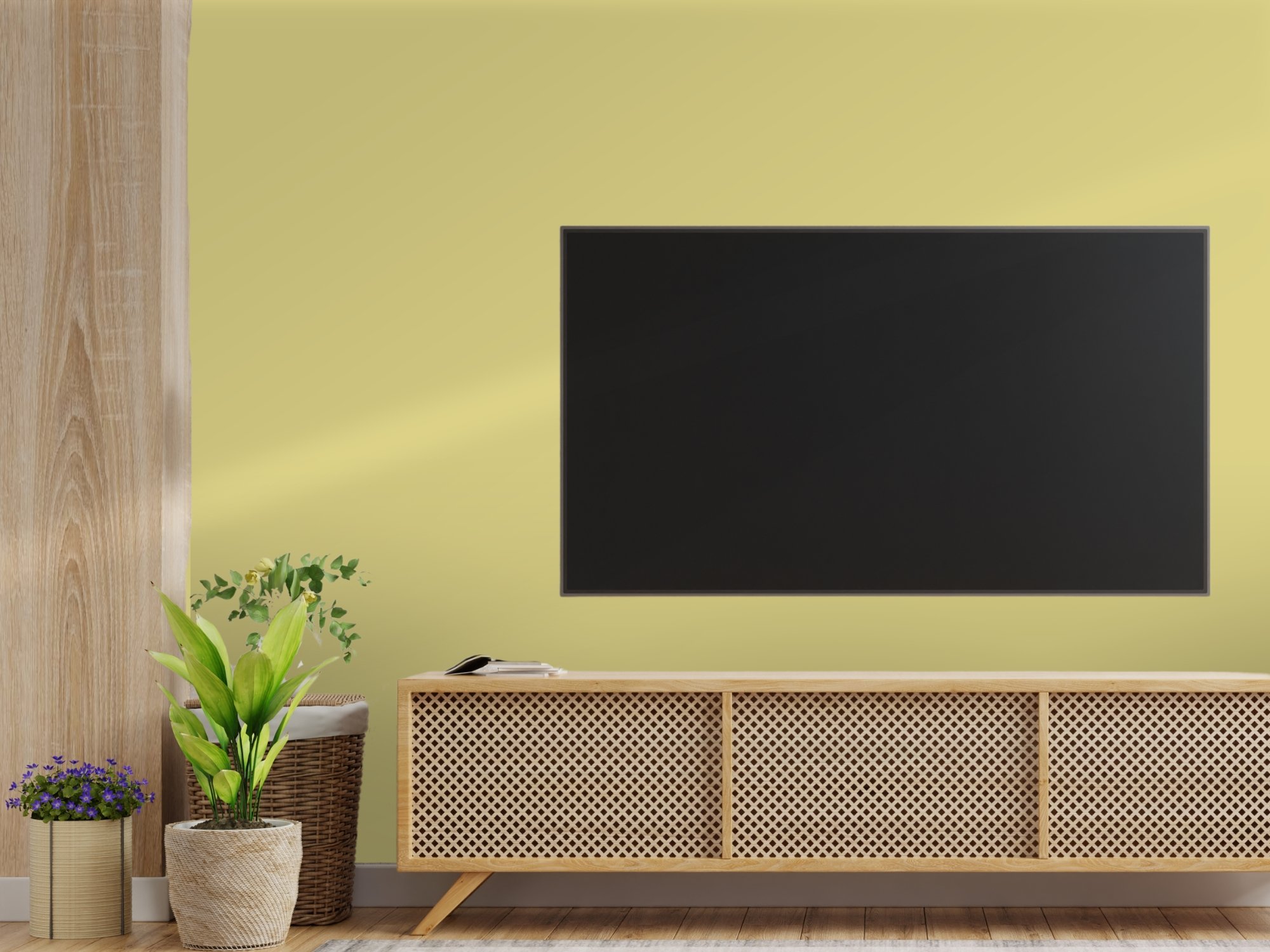
Chartreuse (SW 0073)
If you’re craving a pop of color in your home, “Chartreuse” is your go-to. This vibrant yellow-green shade is perfect for adding a splash of personality to smaller spaces, like a powder room, home office, or reading nook. You can also incorporate it through accent pieces like throw pillows, curtains, or a statement piece of furniture. For a bold approach, use it on an accent wall to bring energy and brightness to an otherwise neutral room.
4. Elevate Your Bathroom with “Rain Cloud” (SW 9639)
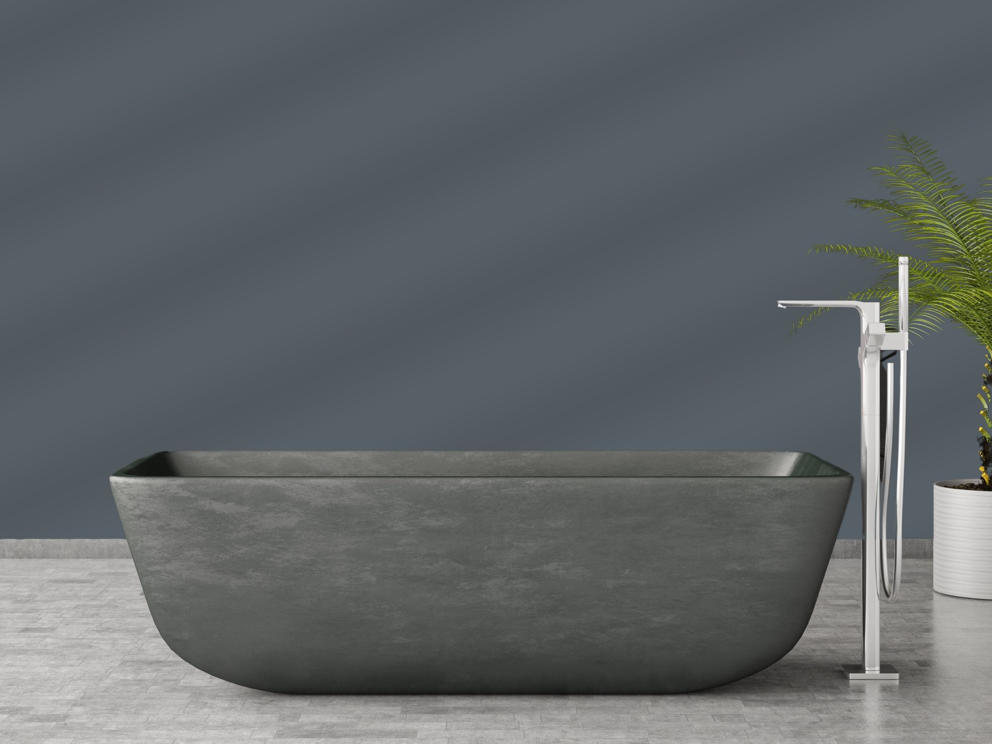
Rain Cloud (SW 9639)
Bathrooms are often overlooked when it comes to color, but “Rain Cloud” is a stunning option for creating a spa-like atmosphere. This deep gray-blue adds depth and serenity to the space, making it feel both luxurious and calming. Pair it with white or light gray towels, chrome fixtures, and dark wood vanities for a modern, polished look. This hue works especially well in spaces with natural light, bringing out its rich, moody undertones.
5. Cozy Up with “Clove” (SW 9605)
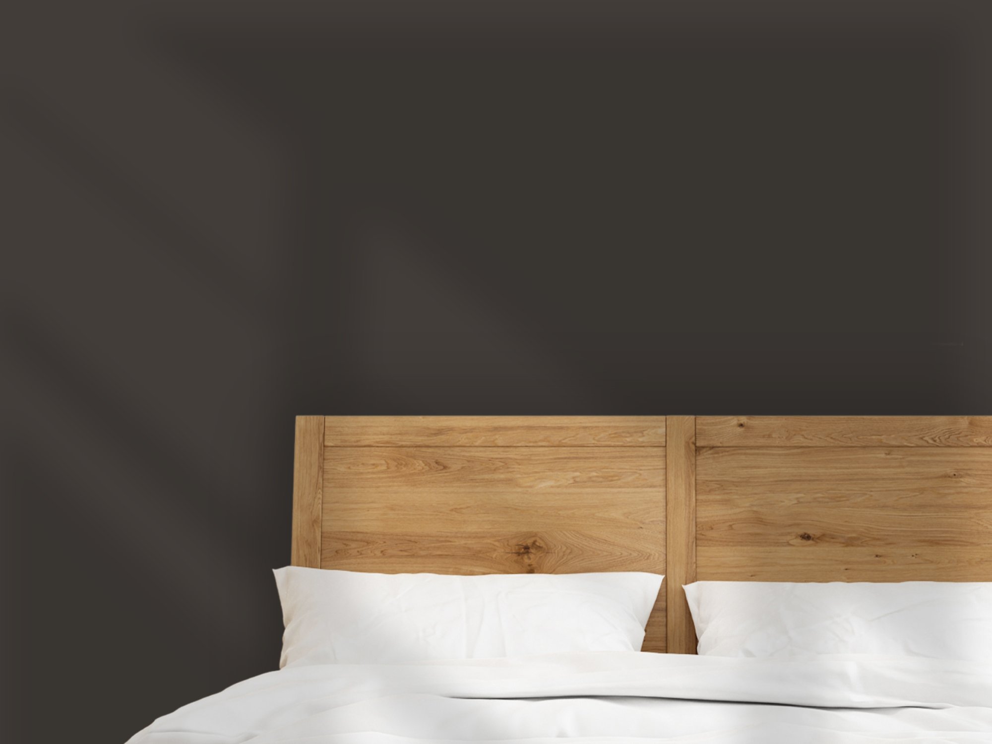
Clove (SW 9605)
“Clove” is a nearly black brown that exudes warmth and sophistication. It works beautifully in dining rooms or cozy bedrooms where you want to create a more intimate feel. This color can also anchor a space when used on lower cabinetry in a kitchen or built-in bookshelves in a living room. Pair “Clove” with cream or beige tones to balance out its depth, or add touches of brass or gold for a hint of luxury.
6. Bring Nature Indoors with “Bosc Pear” (SW 6390)
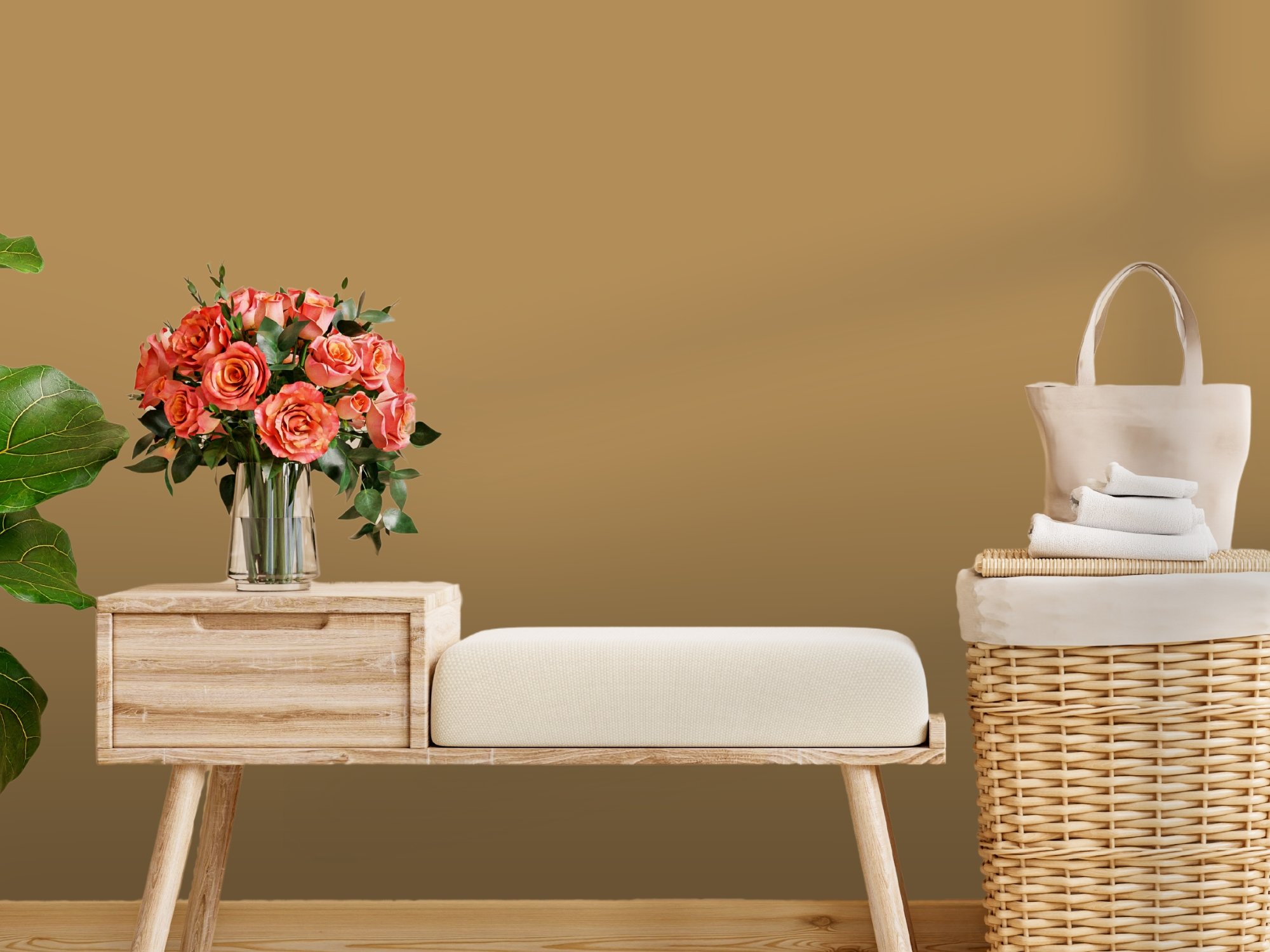
Bosc Pear (SW 6390)
“Bosc Pear” is a golden hue that feels both organic and refined. It’s ideal for spaces where you want to create a natural, earthy vibe, such as a sunroom, breakfast nook, or entryway. This shade pairs beautifully with natural materials like stone, terracotta, and rattan, allowing you to embrace an eco-inspired aesthetic. Incorporating plants and textured fabrics will enhance the outdoor feel of this color in your home.
7. Use “Malabar” (SW 9110) for Tranquility
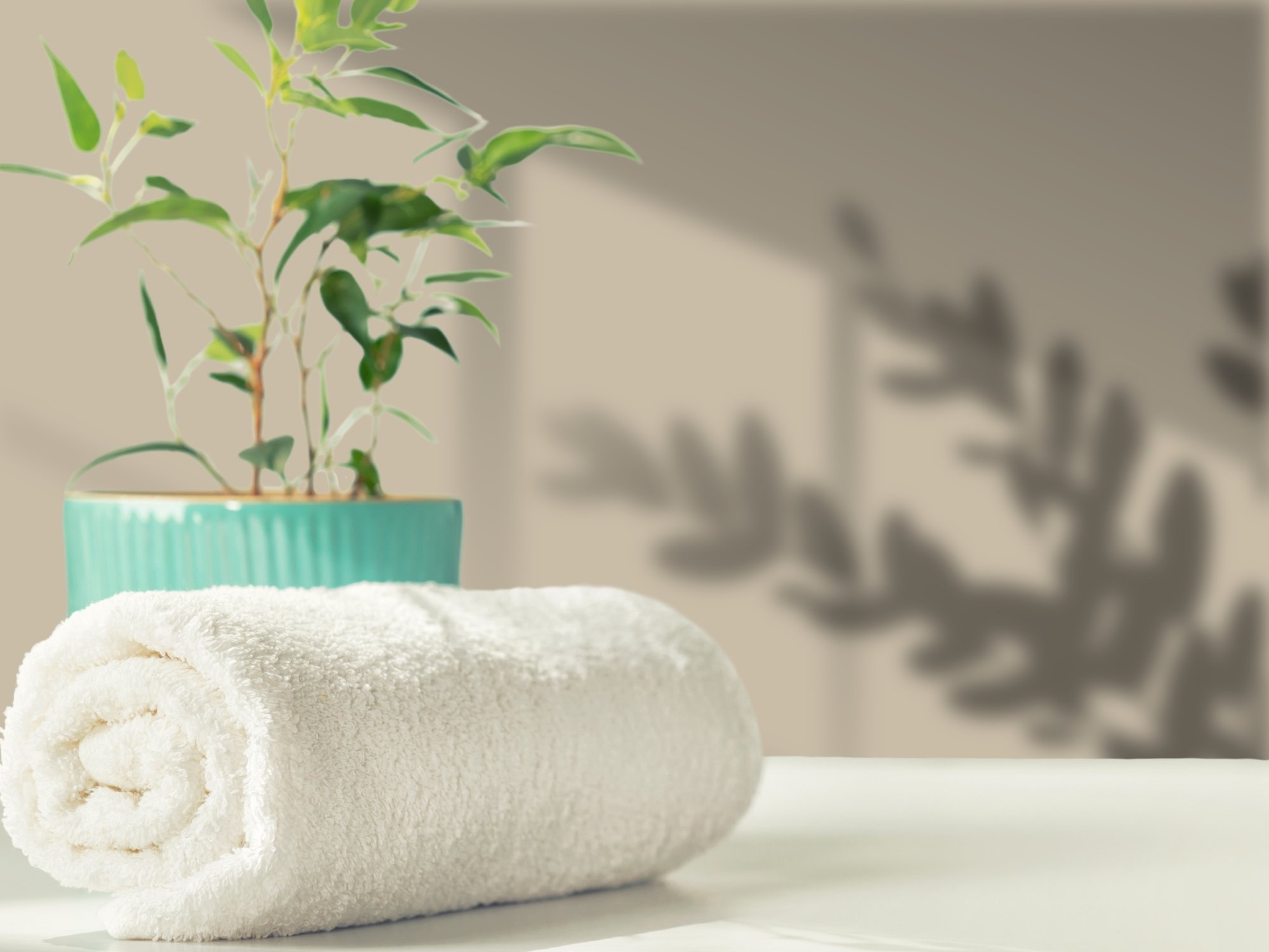
Malabar (SW 9110)
This sandy beige offers a subtle, peaceful presence in any room. Its versatility makes it perfect for bedrooms or bathrooms where you want to create a serene and restful environment. Layer “Malabar” with warm-toned neutrals and soft linens to enhance its calming effect. If you prefer a more layered design, this shade also complements other soft colors from the capsule, like “Mauve Finery” or “Sunbleached.”
8. Brighten Up with “White Snow” (SW 9541)
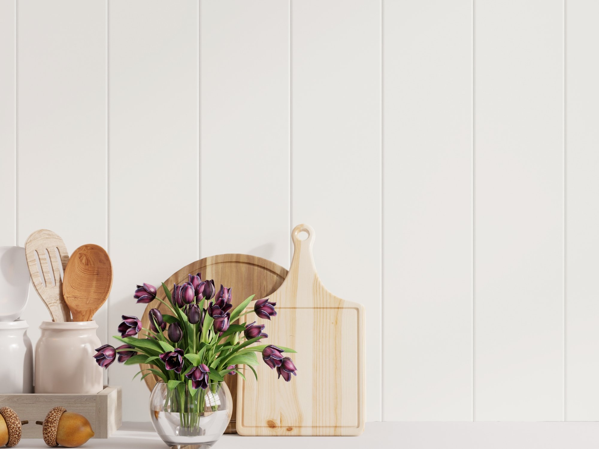
White Snow (SW 9541)
A classic white like “White Snow” is a timeless choice for those who love bright, open spaces. This brilliant white reflects light beautifully, making it ideal for areas like kitchens, bathrooms, or hallways that benefit from a sense of spaciousness. To keep it from feeling too stark, pair “White Snow” with soft textures, warm woods, or small pops of color like “Chartreuse” or “Bosc Pear.”
9. Add Botanical Beauty with “Mauve Finery” (SW 6282)
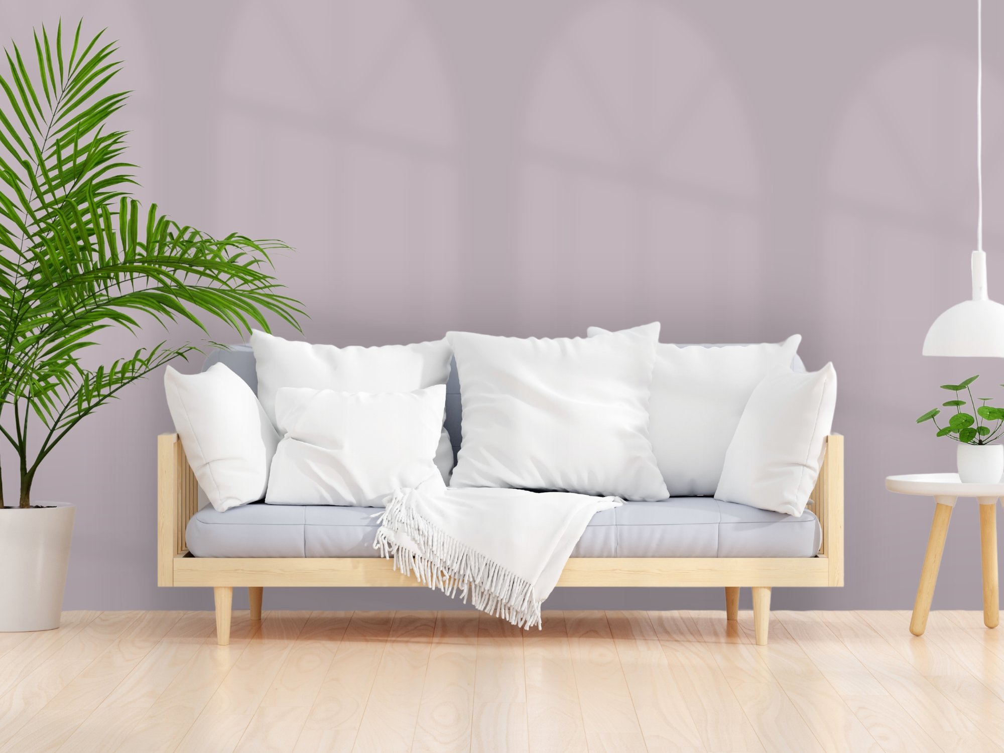
Mauve Finery (SW 6282)
For a touch of romance and sophistication, “Mauve Finery” is the perfect addition. This muted mauve is versatile enough to be used as either an accent color or the main event. Consider using it in a bedroom or living room where you want to bring a sense of botanical beauty and subtle elegance. You can pair it with neutral grays and whites for a modern look or with rich, jewel-toned accents for something more luxurious.
The Sherwin-Williams 2025 Color Capsule offers endless possibilities for creating beautiful, personalized spaces in your home. Whether you’re drawn to the grounding earth tones, soft neutrals, or playful pops of color, this collection provides a versatile palette to suit any style. Ready to try these hues in your own home? Contact a local paint store or interior designer for advice, or explore these colors further using the Sherwin-Williams visualizer.
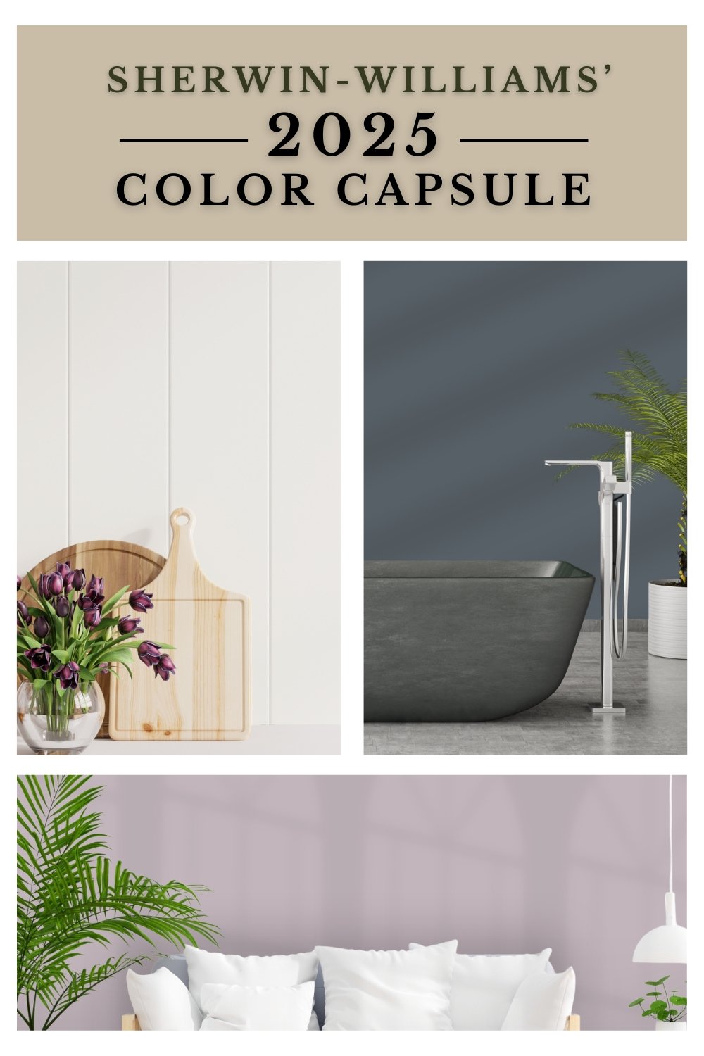
Sherwin-Williams’ 2025 Color Capsule